
Want to know what makes an interior designer’s home shine? COHESION.
While the idea of achieving cohesion is simple, if not approached correctly, it can get lost somewhere in translation. It is one feat to have a single room in your home put together exactly how you want it, but how do you transition seamlessly to the rest of your house without it feeling like a complete repeat in every room?
Today, we are tackling just that: how to create a cohesive look for your entire home by establishing your overall color palette, designing with color in mind, and pulling colors from room to room.
Creating Your Color Palette
Let’s start by talking colors! It can be a little overwhelming for some to embrace an overall color palette for their entire home!! Don’t worry; I promise this won’t limit you!! You will look to your color palette when choosing paint colors, textiles, furniture, and accessories.

For your color palette, select 3-6 colors; anything more can get a little confusing. Start by selecting your primary color, the most prominent color in your home. Next, choose secondary colors and lastly your accent colors. If you are still at a loss for where to begin, check out my favorite paint colors, which are the go-to choices for interior designers. This will be a great start to select a color that can be used throughout your home. You could always choose one of the colors from my home and run with that, too!
Design With Color In Mind
For your house to tell a seamless story gliding with ease from room to room, it is essential to consider your design style in conjunction with your color palette. You want your design style to stay mostly consistent to tell a whole story. I am all for mixing different styles, transitional with modern, and traditional with glam (to name a few). To keep a polished flow, limit your styles so your overall ‘message’ doesn’t get lost.
Once your design style is defined, incorporate your color palette into each room. When selecting paint, furniture, textiles, and materials, choose pieces that complement each other and your color palette. Remember from this post, matchy-matchy materials and furniture are not the way to go. Step out of your comfort zone and try something new!
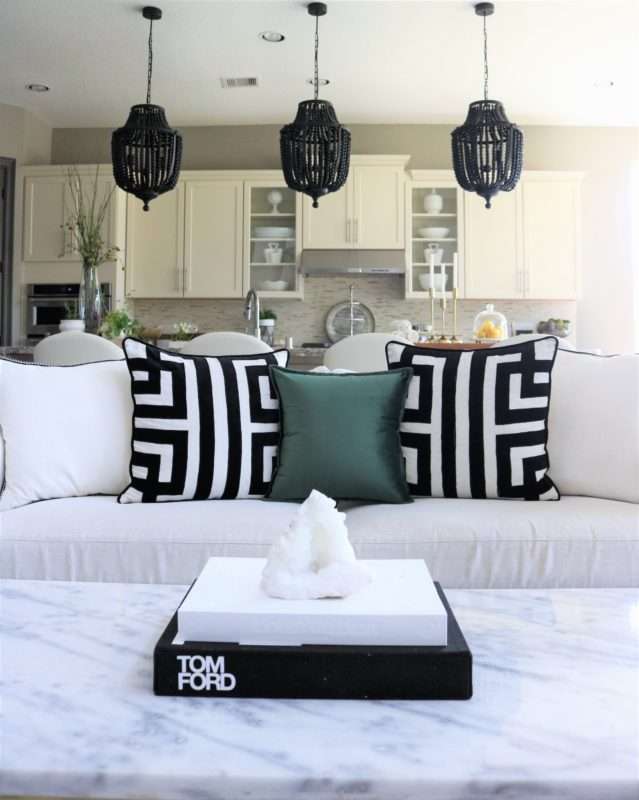
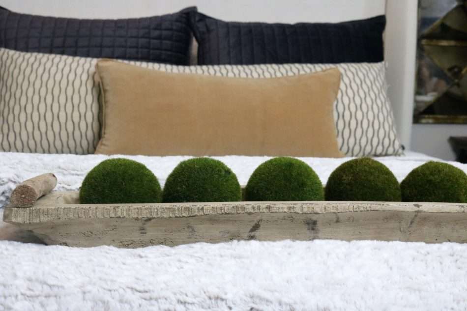
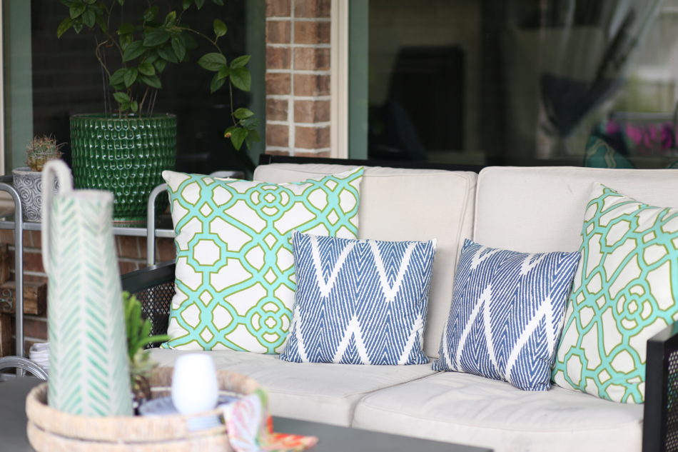
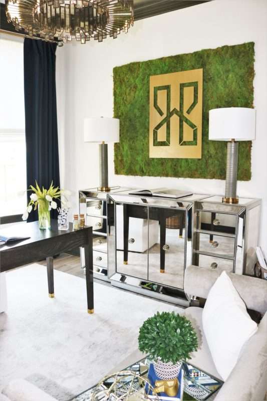
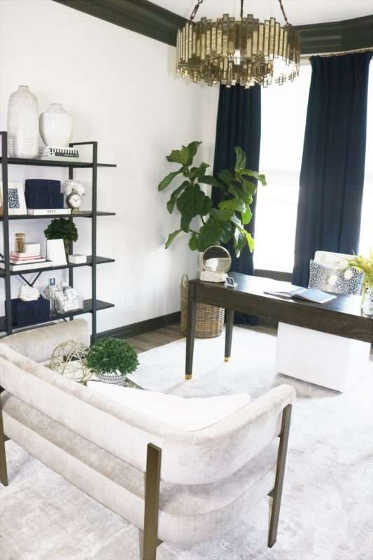
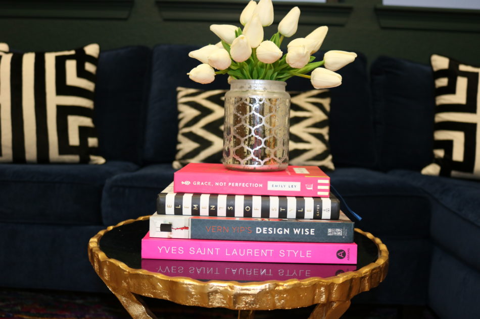
Utilizing your color palette in varying amounts in each room will allow each space to have a continuous flow from one to the next. One misconception is that if you choose a color, you have to stick to that exact color. Instead, use the color family as a guide. While navy is my primary bold color, I also utilize different shades from the blue family to accent it. When I use another accent color (such as the green you will see in many rooms), I make sure that it “plays well” with navy, black, and white.
Bonus: keeping your color palette consistent means that most furniture and accessories can be interchangeable in most rooms/spaces in your home.

Pulling Color From Room To Room
COLOR PULLING! Each room needs to have its own story and feel, but it is also imperative that each room complements the next. How do we transition from one room to another and keep the overall story moving forward? So, what do I mean when I say pull color from room to room? You are taking a prominent color from one room and using it in a different way in the next room. Let me show you.
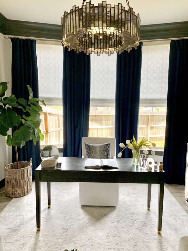
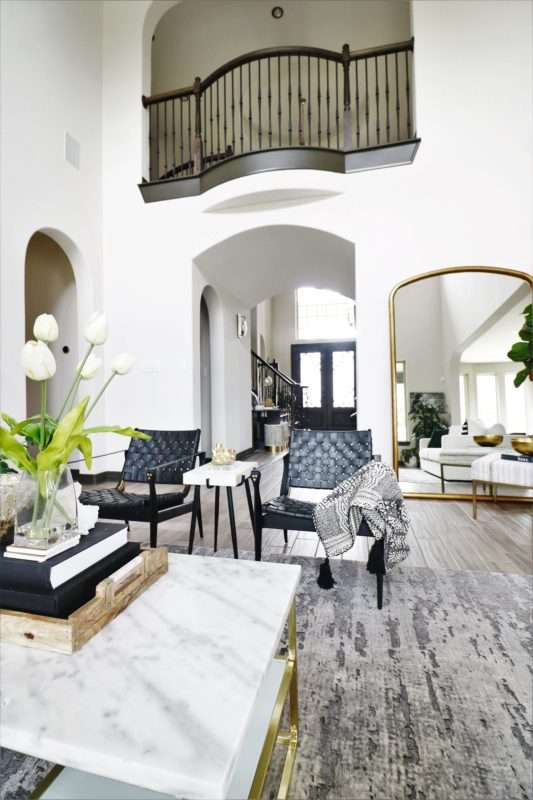
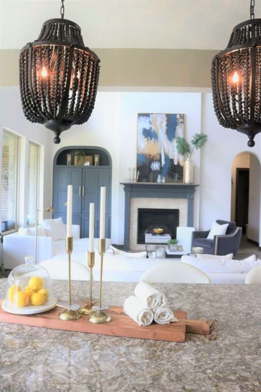
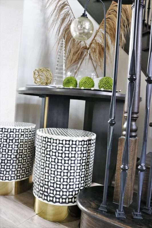
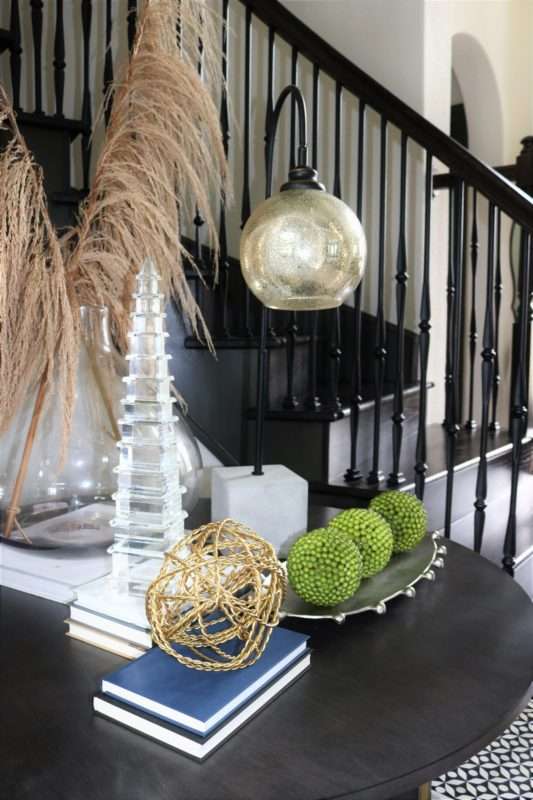
The devil is in the details. Each of our colors in our palette is present in subtle ways. The statement piece in my office is these luxurious, navy curtains… truly show-stopping. As you make your way through our home from the office, stepping into our foyer, you are immediately drawn to the subtle hints of navy.

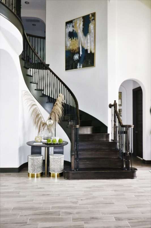
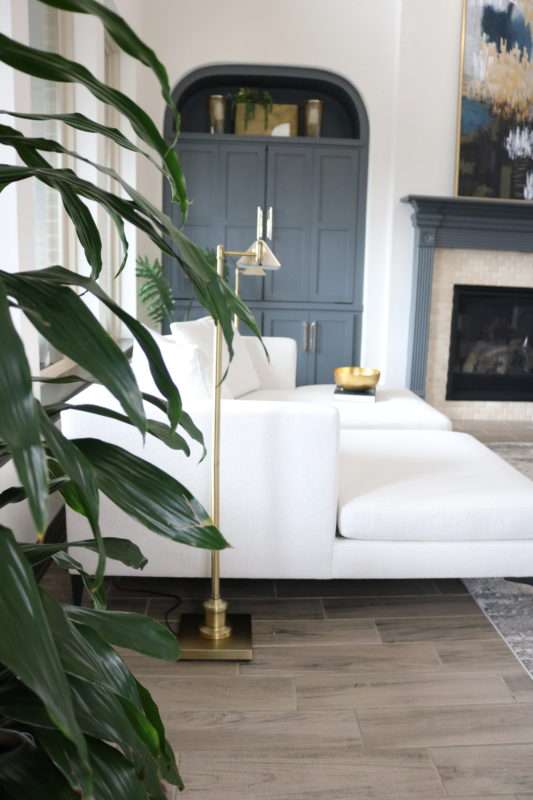
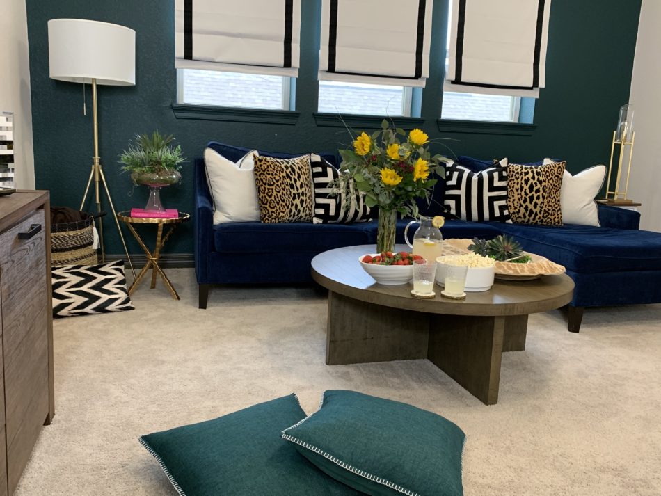
The navy in the art draws your eye upward as you round the stairs and land in our chill spot, setting the stage for the navy sofa along the deep green wall, accompanied by various accessories in black and gold tones from my color palette.
Creating a cohesive home that seamlessly transitions from room to room is no small feat. It has to be planned, designed, and executed to the finest detail. I have no doubt that if you start your design process by creating your color palette, the result will be an entirely cohesive home with well-designed spaces, including furniture and accessories that all complement each other.
Paint Colors In My Home
Main walls throughout the home: Sherwin Williams City Loft
Trim and Doors throughout the home: Sherwin Williams Thunder Gray
Kitchen Walls: Sherwin Williams Pavestone
Kitchen Cabinets: I don’t have the exact color, but I have tried to color match them. Canvas Tan by SW is almost identical.
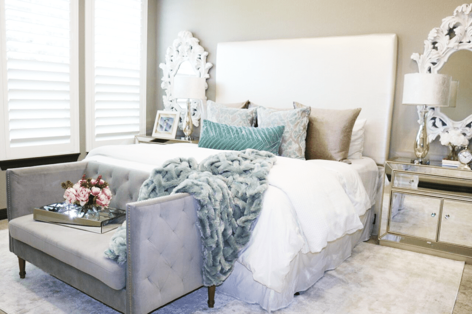
Master Bedroom: Sherwin Williams Pavestone
Masculine Guest Bath: Sherwin Williams Pavestone
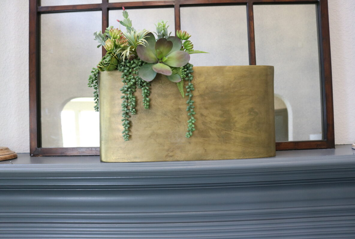
Chill Spot: Benjamin Moore Bavarian Forest
Thoughts?
YOUR COMMENT